Perdido Key Chamber of Commerce
Project Summary
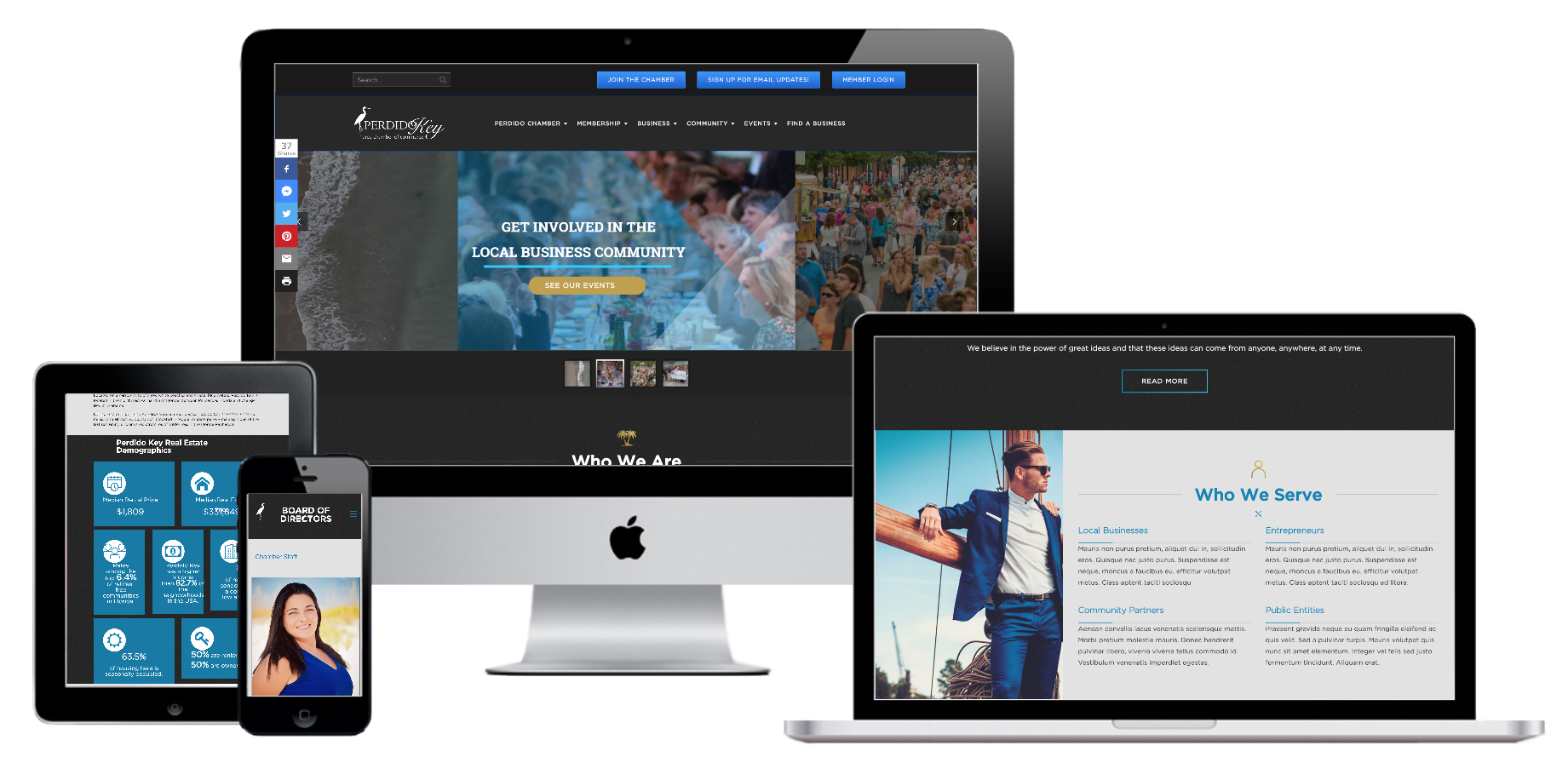
The Perdido Key Chamber of Commerce needed a hub for their entire community to find events, businesses, deals, jobs, and local information. They used a software called Chambermaster, so we decided to fuly integrate the entire software ecosystem into their website allowig them to do everything from managing events from an app to tracking their forms/surveys. All members also have their own portal with which they can log into and manage their business, information, and postings to the community events calendar.
A sleek and modern design was used to guide attention where it needed to go. Informational bricks were also created to quickly and easily give the viewer key demographics about the region.
The Perdido Key Chamber site was built with the goal of being a indespensable resource for the local business community. With the diversity of information conventiantly presented, it has quickly rocketed to thousands of views per month.
Interesting Integration
Complete Integration of Chambermaster Software
Events management
Members Portal for submitting content
Multiple community and business calendars
A local blog
Constant Contact email list sign up
Hundreds of local businesses categorized and searchable
Neon Dystopia
Project Summary
Neon Dystopia was created in November 2014 with the idea of bringing together fans of Cyberpunk as well as opening it up to new audiences. The key to this was the idea of sharing a mixture of content; reviews of new material, retrospectives on classic content, critical analysis, personal stories, fiction from aspiring writers and more.
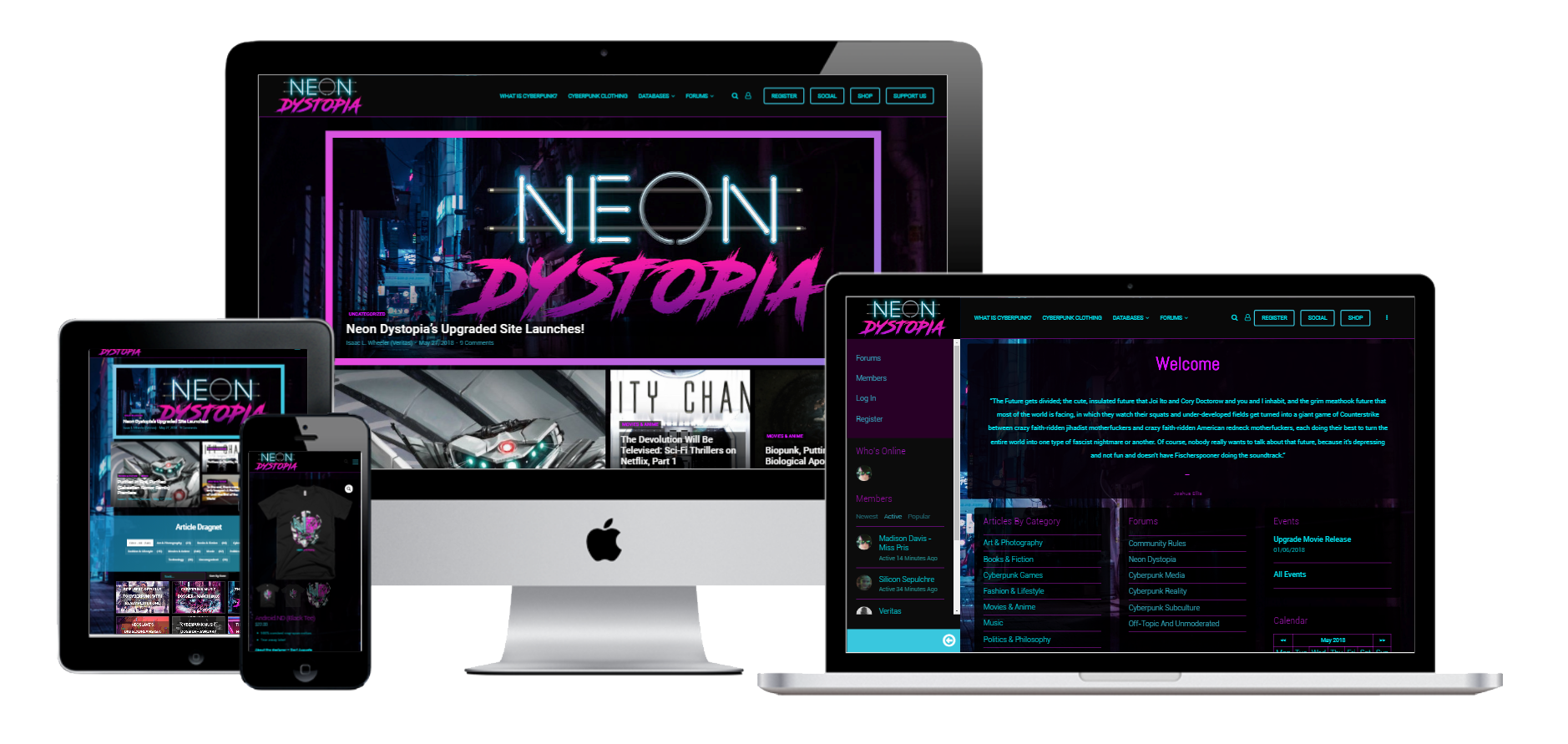
Neon Dystopia contracted us to build their dream website, a social media network fused into a news and publishing organization. Members can register profiles in order to interact with content and each other, are able to friend each other and communicate privately. the social network was designed to be a cyberpunk fusion of Facebook and Reddit, allowing for friendships, and forum style discussions on a variety of topics.
An eCommerce store was also built in and integrated into the Printful 3rd party service allowing for only an image to be automatically turned into a variety of merchandise such as clothing, hats, cups, pillows, posters, and towels.
The visual aesthetic was of paramount importance, the site needed to be a work of art just as much as it was a social media network or news organization. This is why we meticulously designed every little detail to fit the aesthetic of the cyberpunk art style.
Interesting Features Integrated:
A Complete Social Media Experience Featuring Forums, Live Chats, Posting, Sharing, Unique User Profiles, Likes, Rankings, and User Roles.
Smart Post Search & Filtering
Tax Compliant Automated Donations Handling Systems
Even Management & Scheduling System
Smart Article Recommendations Based on User Interests
Tax Compliant Automated Donations Handling Systems
An Assortment of Smart and Searchable Databases Featuring Information on Hundreds of Books, Movies, Comics, Short Films, and More
Many More…
Tsukasa of Tokyo
Project Summary
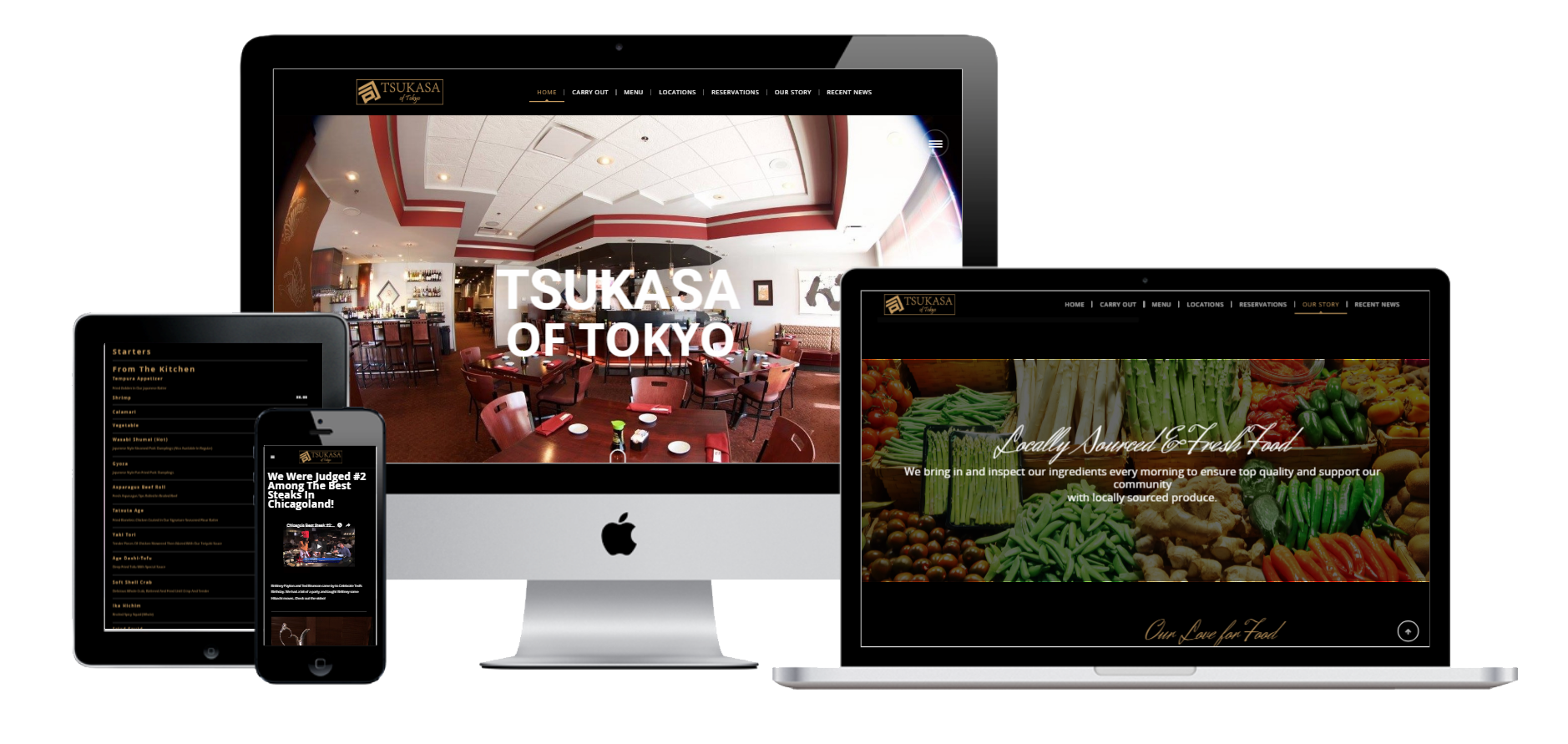
Tsukasa sought out Chicagoland Coders to design a new site from the ground up which allowed for a quick capture of attention using powerful visual elements and interactive sliders. The goal was to be a base for customers to be able to quickly contact the front desk for scheduling reservations and to easily provide access to a intuitive view of their large menu.
We integrated a variety of aesthetic elements such as movement reactive and button integrated slideshows on the home page. We also used parallax scrolling throughout the site to give it a cohesive branded look.
We designed the menu so it would be simple to access on both mobile and web by incorporating large buttons that unfold the entire menu depending on which service you were interested in attending. This intuitive interface allowed for quick access and would keep customers from leaving the site due to low interactivity.
Christian Worship Center
Project Summary
The Christian Worship Center was in need of a way to more effectively communicate and coordinate with their members of all ages.
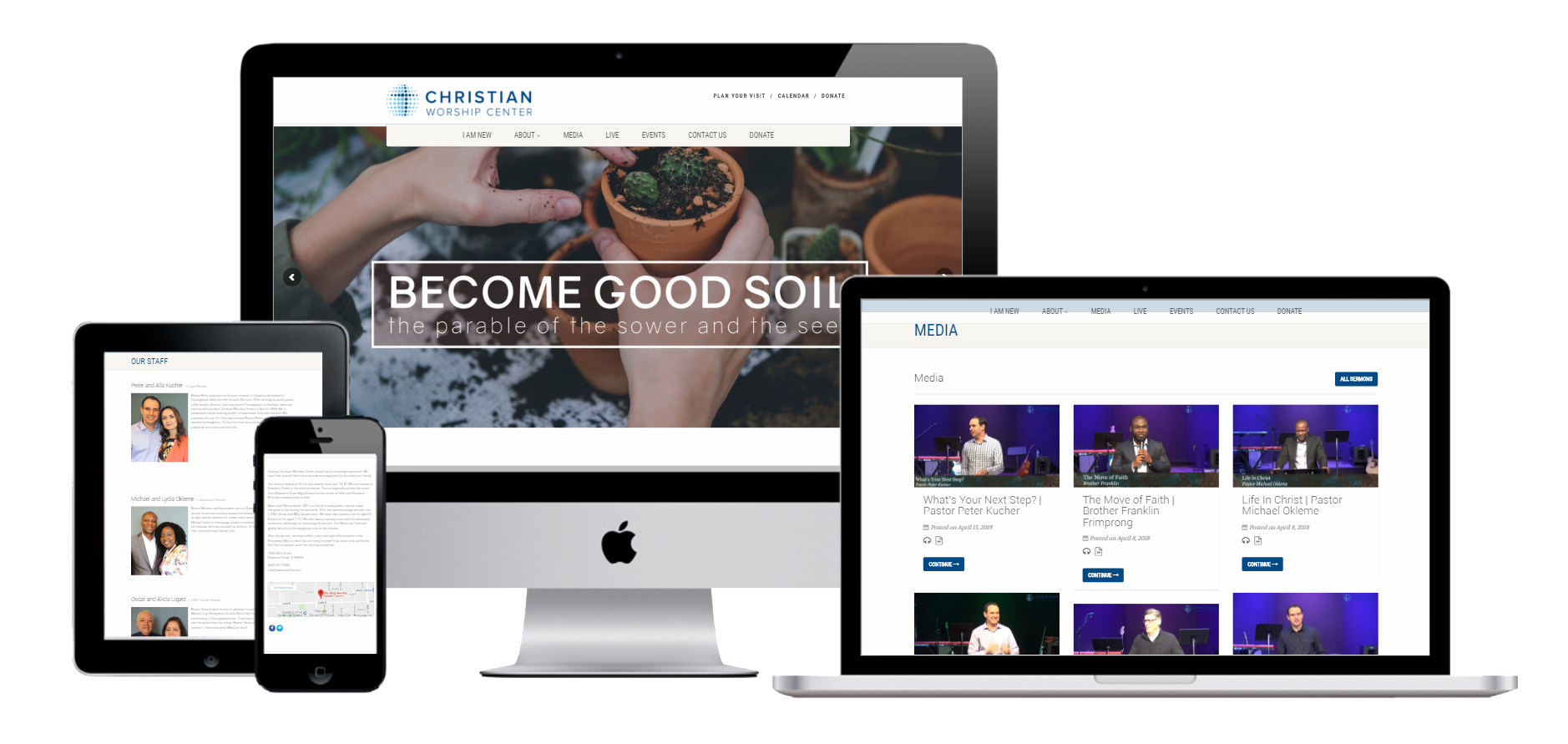
We guided the founders of the church through a creative process that lead to the development of a user friendly website packed with intuitive ways to access the information members needed. As per our client’s requirements, we developed a beautiful custom WordPress layout and creatively implemented content with a strong SEO framework to build an online awareness to people looking for a new church to attend.
A large variety of custom features was implemented into their site such as live streaming and recording every single sermon so its available on site, an interactive calendar for community members to access, a paypal donations module, and a method to submit parking permit requests through their site.
Interesting Features Integrated:
Live Streaming
Video Podcast Library
Tax Compliant Automated Donations Handling Systems
Even Management & Scheduling System
Wonderland Gardens
Project Summary
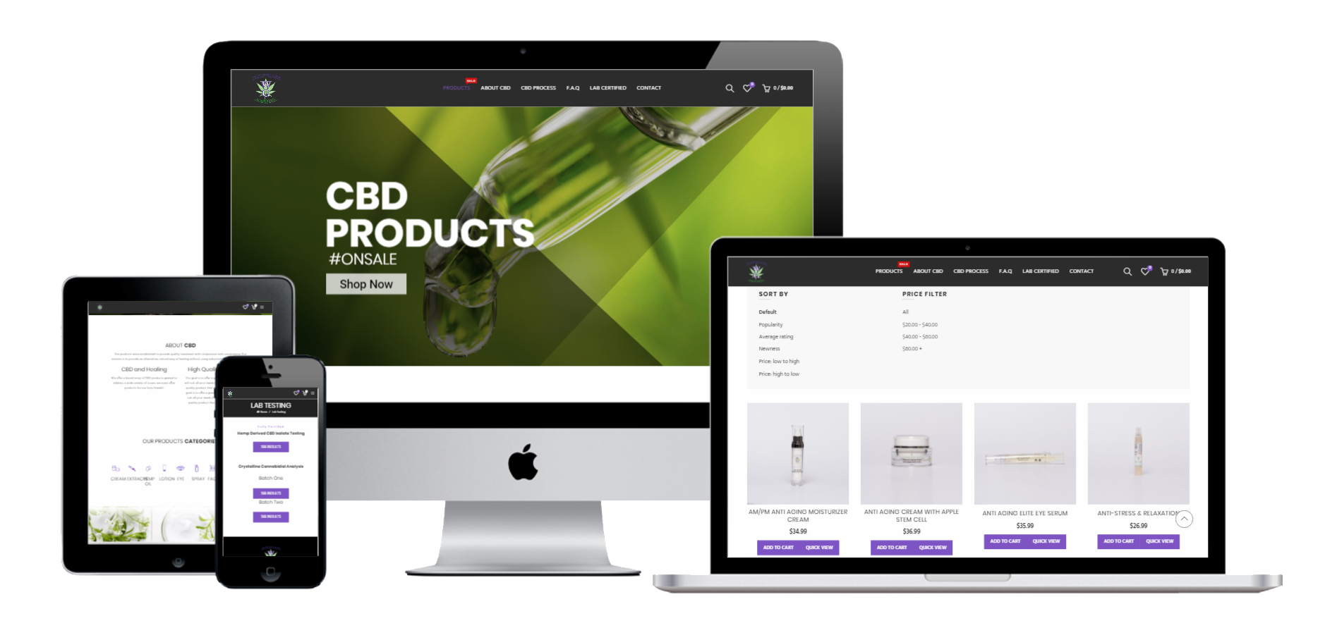
Wonderland Gardens contacted us with their need for a sleek, modern, E commerce website to sell their line of CBD infused products. After careful consultation we realized there were many careful legal elements we had to balance while designing the experience. The primary focus was a design that fused the marketing and product display in order to successfully increase conversions.
We saw the proper solution to be a wordpress site designed from the ground up to fit their need, we integrated beautiful animated graphics and plenty of natural imagery to convey the health conscious and organic nature of their products to the client.
A seamless shopping cart experience was also necessary with taxes, shipping, and labels all being calculated and automatically provided to the store admins. A mobile app was also supplied to track and manage sales/shipping.
Eye Meets Color
Project Summary
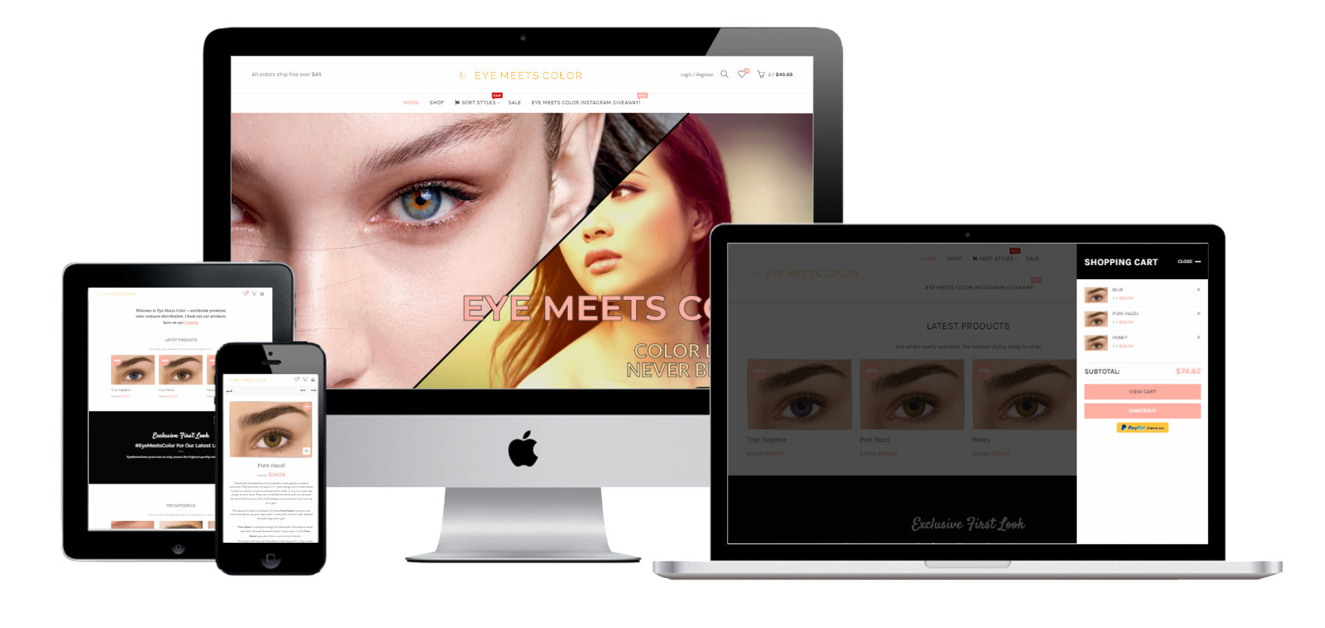
Eye Meets Color is an international ecommerce supplier for colored contact lenses. Their target audience is young women who are interested in Korean beauty. In order to bring their brand online, we agreed to build a brand new site from the ground up. With a modern design, complete integration with all their social media profiles, and a fully automated ordering system, the vision was brought to life.
We designed the site to be sleek and modern, with feminine appeal. The visual focus was on the products themselves. The eCommerce management system allowed for all orders to be calculated automatically and apply the proper taxes and shipping costs. In the backend, all this data is accessible in an organized manner for clean record keeping. A mobile app was also provided for tracking store sales statistics, order management, and customer inquires.

